 Have you ever noticed the various icons found on your car’s instrument cluster? If so, you’ve probably recognized that some of these icons are not visible until illuminated. The reasoning behind it is simple. These particular icons are not required to light up unless your car is experiencing a “health” issue, such as an engine problem, low tire pressure, or a low fuel level. Regardless of the problem, these hidden icons utilize a screen printing technique known as deadfronting (or dead fronting).
 In simple terms, deadfronting can be thought of as icons being nonexistent or “dead” from the viewer’s perspective. This means that the icons appear to blend into the background of the overlay they are incorporated into, until they become illuminated or backlit. Deadfronting hides the warning icon until it is backlit to alert the end user of any issues or problems. It’s oftentimes incorporated into products such as graphic overlays, membrane switches, or instrument dials and gauges.
Deadfronting also helps to visually enhance your product’s design. Your user interface design can appear to be more aesthetically appealing when you incorporate deadfronting. This is primarily because the product will appear to be clean with minimal icons or features noticeable from the front view unless otherwise backlit.
Levels of Deadfronting
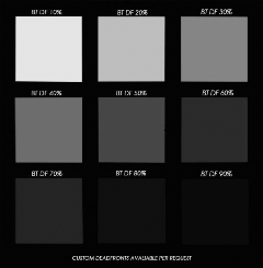
 Depending on your specific needs, deadfronting can be added at different densities and color variations. In most scenarios, deadfronting is incorporated into a black user interface design. This means that the icons used in the design will appear to blend into the black background, unless otherwise illuminated. However, in other scenarios, such as within health care, deadfronting is oftentimes used in an all-white design. There are also different levels, or percentages, of deadfronting. When designing a deadfront, it is important to find the appropriate balance between the invisibility of the icon when not backlit and the required brightness when backlit.
You can also incorporate color into your deadfront design. For example, think about your car’s turn signal. When it’s not in use, the icon is not visible as it blends into the background color. However, when you use your turn signal, it illuminates green. The color is screen-printed directly into the product’s design, so no special lighting is needed for the color to be seen. In the case of the turn signal icon, the green coloring is screen printed directly behind the deadfront and is only visible when backlit with a white bulb.
Other examples of this on your instrument cluster would be warning icons such as oil pressure, tire pressure, or low wiper fluid. These are typically constructed the same way with the deadfront, however, they can utilize different colors of ink in the design.
Deadfronting is extremely beneficial in your User Interface design because the design helps to promote the functionality of your product. Stay tuned for part two of this series, where we will discuss common industries deadfronting is used in.
Interested in networking to learn more on similar topics? Join PRINTING United Alliance's Industrial Applications and Printed Electronics Committee on Sept. 30 to take a deep dive into this industry.
Jaclyn King is a digital marketing specialist at Butler Technologies. Butler Technologies is a printed electronics solution provider that develops User Interface and Printed Electronics.